Problem
Aural had a strong visual direction, but every product surface still needed a clear answer for movement: what reacts, what waits, what leads, and what stays still.
Aural already had a visual language for sound. My work was to define how that language should behave in product: taps, transitions, rewards, player states, sound cues, and moments where motion had to explain what changed.
Aural had a strong visual direction, but every product surface still needed a clear answer for movement: what reacts, what waits, what leads, and what stays still.
I turned sound-led ideas into motion rules, reusable timings, easing curves, trigger logic, and small interaction patterns designers could apply in real screens.
The system gave design and engineering a shared motion language: fast feedback for controls, softer transitions for surfaces, and expressive movement only when it helped.
Why motion needed its own system
Aural was not only a static design system. It had audio cues, player actions, rewards, unlocks, settings, and feedback states. Those moments needed motion rules, otherwise every designer would solve movement differently.
The question was simple: when a user taps play, unlocks an episode, sees a reward, or moves through the player, what should the interface do? Motion had to make that answer consistent across the product.
User interaction creates two kinds of response:
The animation system connected the visual theme with audio feedback, so the product did not feel like sound and UI were designed separately.
Approach
The first step was not choosing easing curves. It was mapping common sound ideas to useful interface movement: frequency bars, echoes, vibration, radial bursts, spectrograms, and waves. Each one suggested a different motion pattern.
From there I separated interaction motion from motion graphics. Interaction motion had to improve usability. Motion graphics could carry brand feeling, but only when they did not interrupt listening, paying, reading, or choosing.
Good for playback, listening state, voice input, or audio settings.
Vertical rhythm with changing height, low amplitude by default, stronger when audio is active.
Good for notifications, alerts, confirmation, and moments where sound leaves a trace.
Repeated fade and scale, each repeat lower in opacity and slower than the previous one.
Good for quick warnings, wrong actions, or tactile feedback.
Short horizontal or scale movement. Keep it tiny so it does not feel broken.
Good for play, unlock, premium success, and reward moments.
Lines or particles expand from one source, then fade before they become decorative noise.
Good for atmospheric brand surfaces, audio identity, and background motion.
Layered gradients, particles, or noise fields that move slowly with the feeling of sound.
Core principles
Every animation needs a job: confirm, guide, explain, or connect.
Motion should follow the direction and weight of the interface. It should help the next state feel expected.
Transitions should connect states without hard jumps, especially in listening and player surfaces.
Touch feedback should feel immediate. If the user taps, the product should acknowledge it fast.
Movement should use curves, easing, and small variation so it does not feel mechanical.
Motion should not block usage. Reduced-motion alternatives must preserve meaning without unnecessary movement.
Similar actions should move in similar ways, so the product does not feel like multiple systems stitched together.
Motion should carry information: hierarchy, status, progress, focus, or relationship between elements.
Core feelings
These three words made motion easier to review. Instead of saying “make it nicer,” we could ask whether the movement should feel soft, active, coordinated, or intentionally still.
Used for transitions that should feel connected instead of rigid. Good for artwork shifts, player surfaces, and state changes that need a soft hand.
Used when the product needed momentum: play actions, unlocks, streaks, rewards, or surfaces where the product should feel active.
Used when many elements move together. One movement leads, the rest support it, so the screen feels coordinated instead of busy.
Motion tokens
The system needed enough structure for engineering, but not so much that every designer had to think in graphs. I defined a small token scale around the job of the motion: feedback, transition, surface change, or expressive moment.
Tap response, pressed state, icon feedback, control acknowledgement.
80-120ms
cubic-bezier(0.2, 0, 0, 1)Small state changes, toggles, compact controls, quick opacity or scale shifts.
120-180ms
cubic-bezier(0.2, 0, 0, 1)Cards, bottom controls, labels, artwork shifts, player UI changes.
180-260ms
cubic-bezier(0.16, 1, 0.3, 1)Sheets, full-screen overlays, onboarding steps, player to detail transitions.
260-420ms
cubic-bezier(0.16, 1, 0.3, 1)Unlock, reward, success, premium upgrade, or sound-led branded moments.
500-900ms
staged, with leading and trailing elementsMost product motion used a fast start and soft settle. The curve should feel responsive, then get out of the way.
Reusable patterns
Give the user a tiny pre-move before a larger change. A sheet can compress slightly before opening, or artwork can settle before controls appear.
Every high-frequency action needs a response. Play, pause, like, save, follow, unlock, and pay should answer the user immediately.
Do not move everything at once. Lead with the element that changed, then bring supporting information after a short delay.
Use motion to show relation: where an item came from, where it went, what changed, and what is now available.
Do and do not
Handoff
The final motion guideline was not just a moodboard. It documented what designers should decide before handoff: timing, easing, starting state, ending state, overlap between elements, delay, repetition, trigger, color transition, text animation, and sound interaction.
The practical test was simple: if another designer picked up a player state, a paywall, or a listening surface, they should know whether the motion should be organic, energetic, symphonic, or intentionally still.
Motion spec template
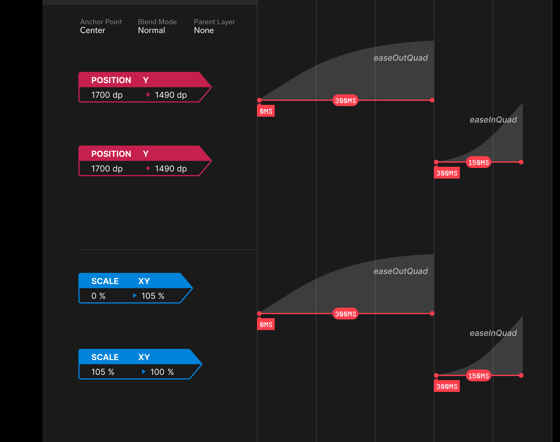
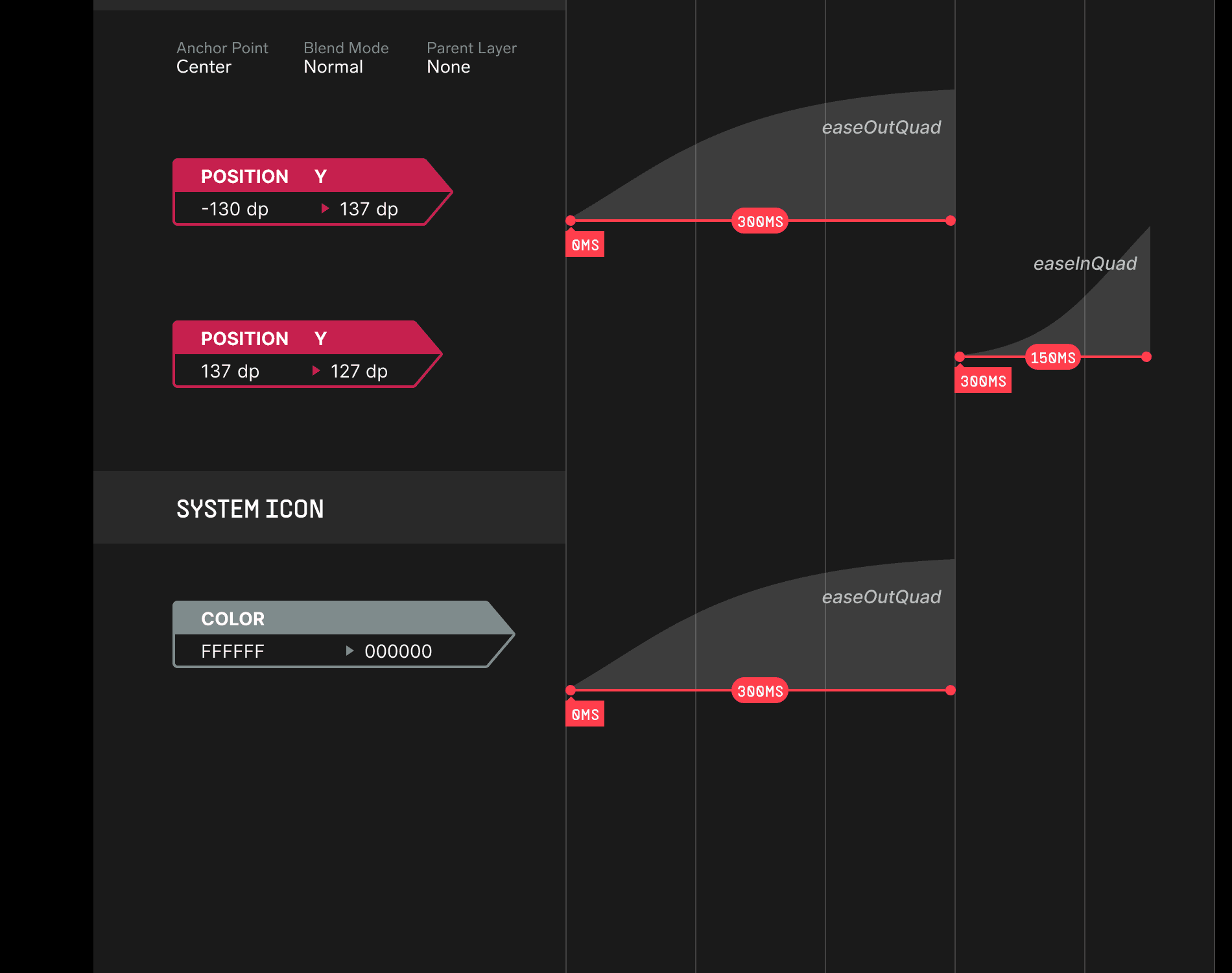
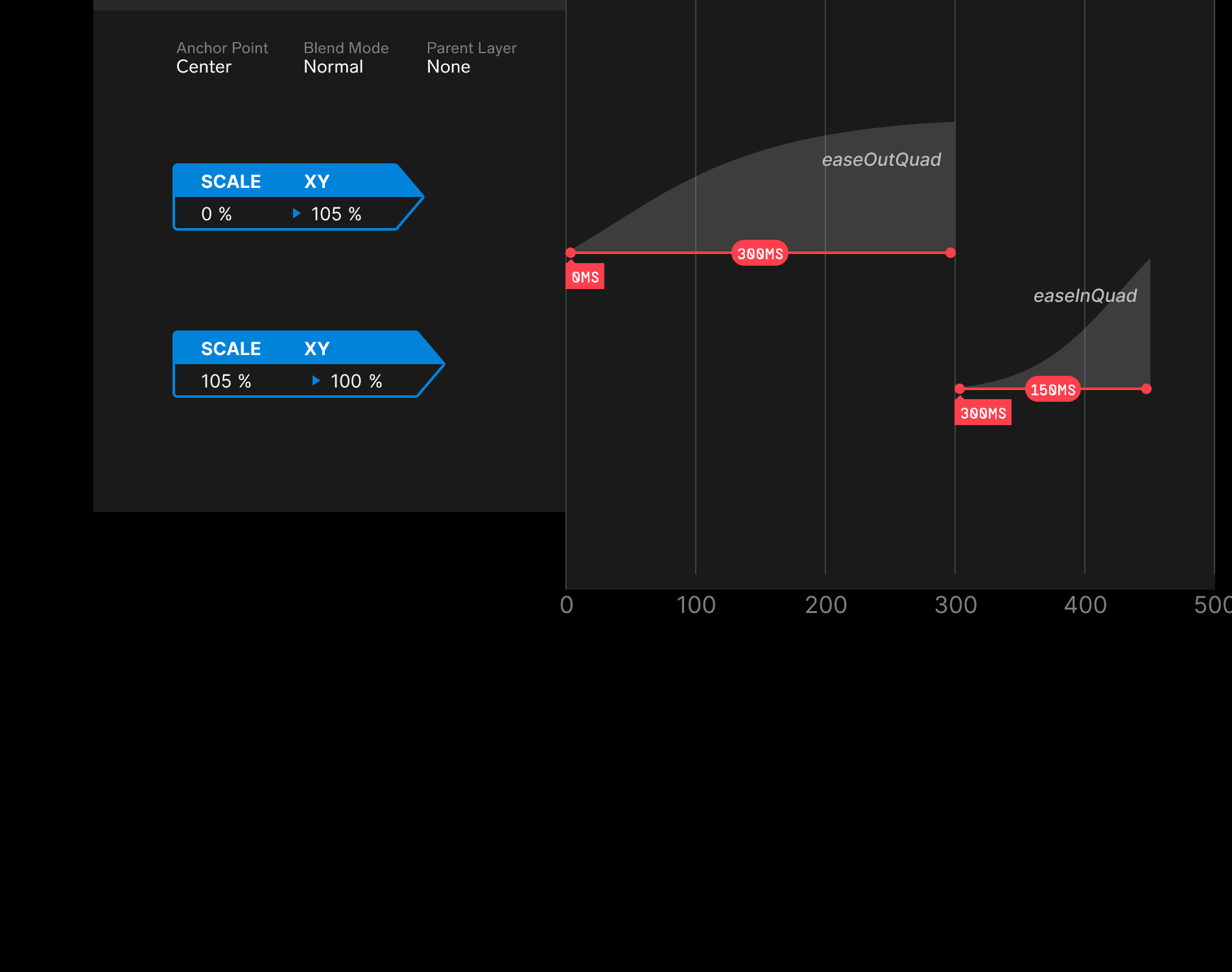
Prototype links are useful for feeling the animation, but they often fail at exact handoff. Developers still need to know the starting value, ending value, easing, delay, duration, anchor point, parent layer, blend mode, and how multiple properties overlap.
To make that handoff clearer, I created a motion design spec template in Figma. Designers could document the animation like a timeline, not just say "check the prototype." The template made motion review more concrete and gave engineering a source they could implement against.
Examples and next layer
This case study explains how the animation language was defined. The next useful view is the actual library: categorized Lottie files for rewards, unlocks, loaders, special events, and product moments where designers can inspect the behavior directly.
The motion rules become easier to use when designers can open real files, play them, pause them, and compare how the same language shows up in rewards, unlocks, loaders, and special moments.
The next useful layer is recipes for common components: player controls, bottom sheets, onboarding steps, premium moments, carousels, toast feedback, and empty states.
The spec template helped handoff. Platform-level motion tokens would make the timings and easing values easier to reuse without recreating them in every implementation.
A short QA pass should cover frame drops, reduced motion, text readability during movement, sound sync, delay, and whether the motion still makes sense without sound.