
Problem
Pocket FM needed predictable subscription revenue, but its PPV (pay-per-view) coin economy drove most of the business. Premium had to grow without weakening that engine.
I built Pocket FM's first subscription product without breaking its coin economy.
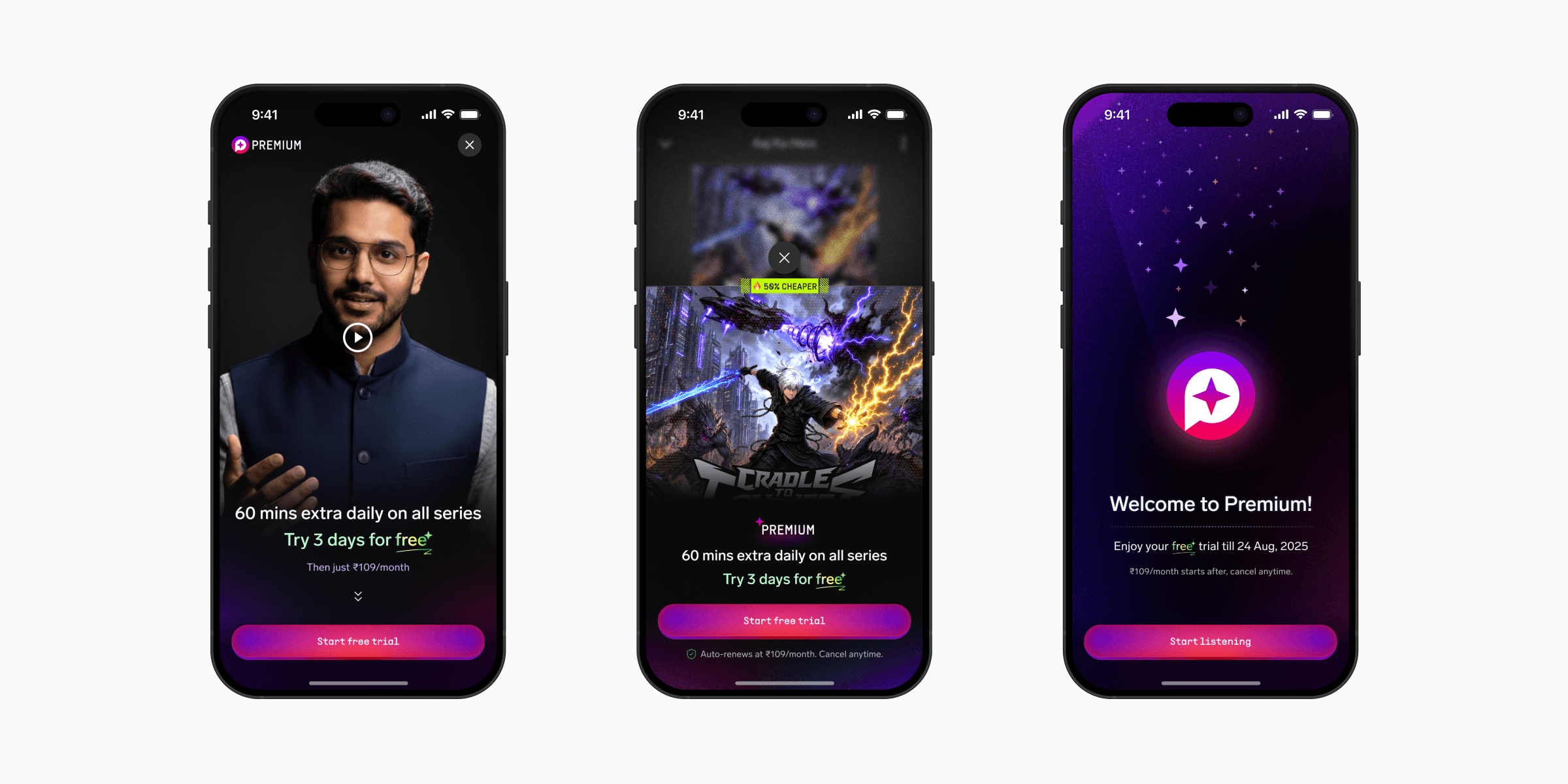
Pocket FM needed predictable subscription revenue, but its PPV (pay-per-view) coin economy drove most of the business. Premium had to grow without weakening that engine.

I designed Premium across onboarding, paywalls, store, coin-spend nudges, daily unlock states, savings moments, localisation, and reusable Aural (Pocket FM's design system) components.

Subscription grew from zero to ~20% of total revenue. 400K+ active subscribers now use it, and the coin-purchase nudge lifted Premium conversion by 16% while PPV revenue held.
Impact
~20%
Subscription as % of total revenue. Started at zero at launch.
400K+
Active subscribers across India and USA.
55%
Trial adoption on allocation at V1 launch.
25%
Further listening depth into the subscriber's primary show.
1 in 5
Lapsed subscribers resubscribe within 90 days organically.
16%
Uplift in premium conversion at the coin-purchase touchpoint.
PPV revenue held throughout. We shipped subscription without touching the coin economy. That constraint shaped the model, the touchpoints, and the decision to keep Premium beside coins instead of above them.
Repeat behaviour mattered most: a third of Indian subscribers re-subscribed at least once, and repeat subscribers drive nearly half of India subscription revenue.
Design work
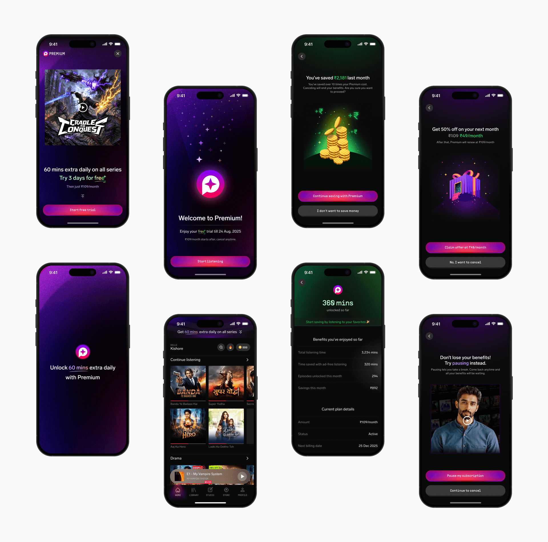
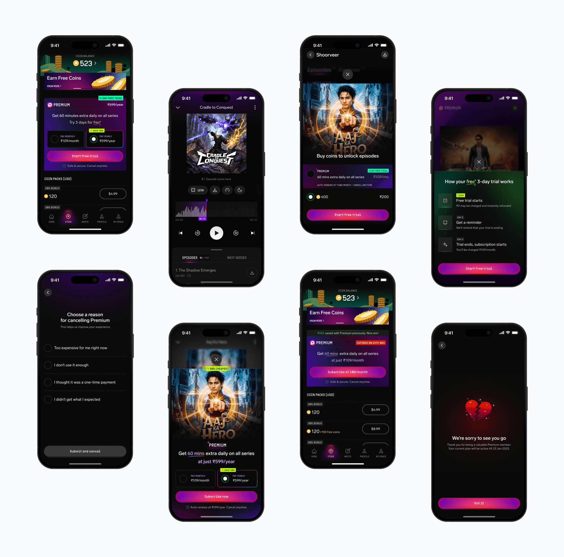
I placed Premium inside moments where listeners already made decisions: onboarding, paywalls, store, coin spend, daily unlocks, renewal, and cancellation. I then folded those patterns into Aural, Pocket FM's design system.
The early screens read like feature lists. I stripped them back to one benefit, kept "Free" as the anchor across trial and paid states, and used show artwork at hero scale so the offer felt tied to a story the listener already cared about.
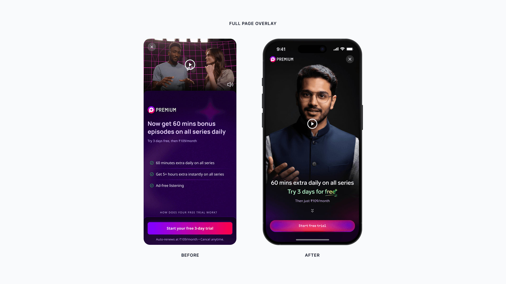
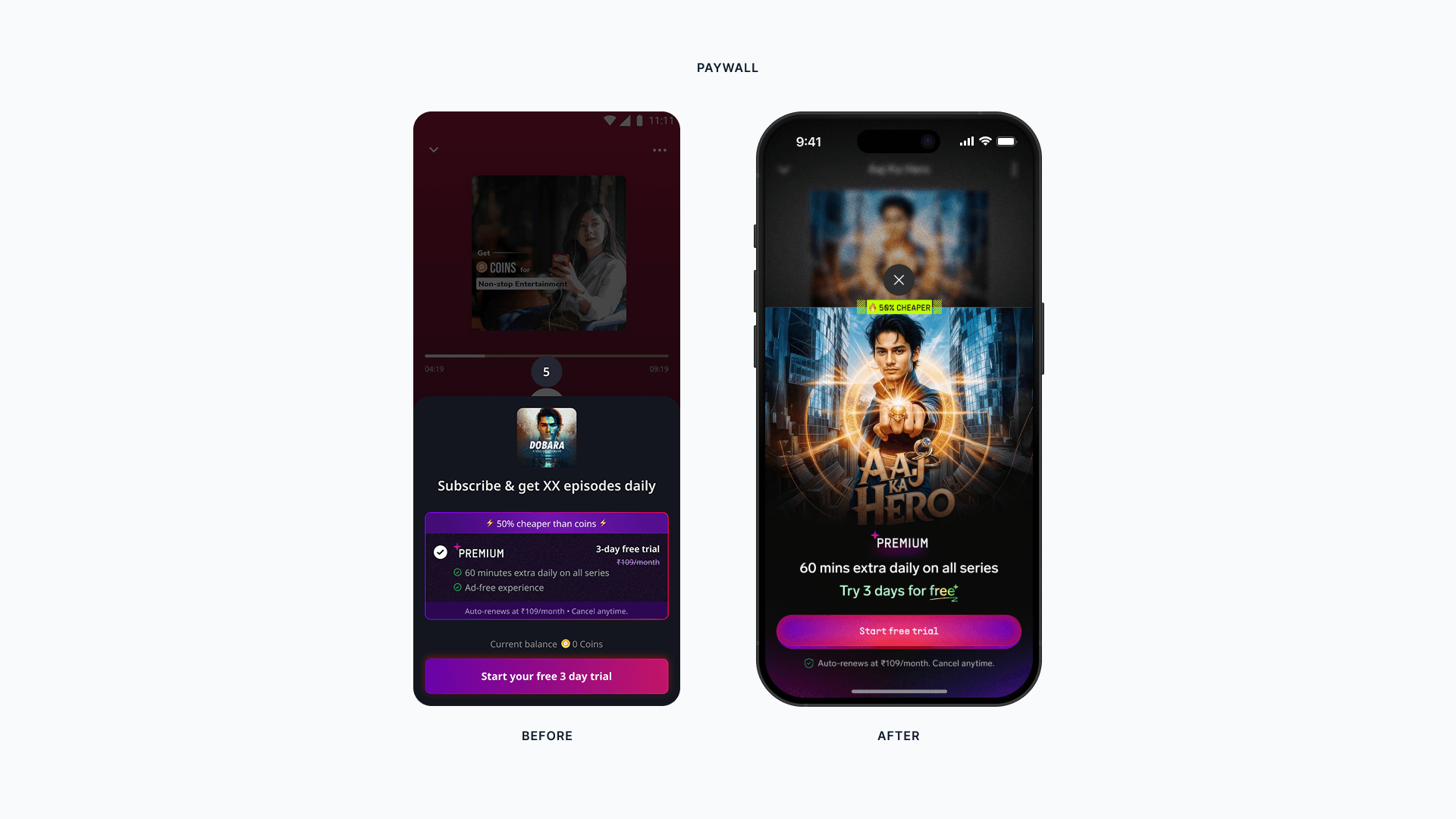
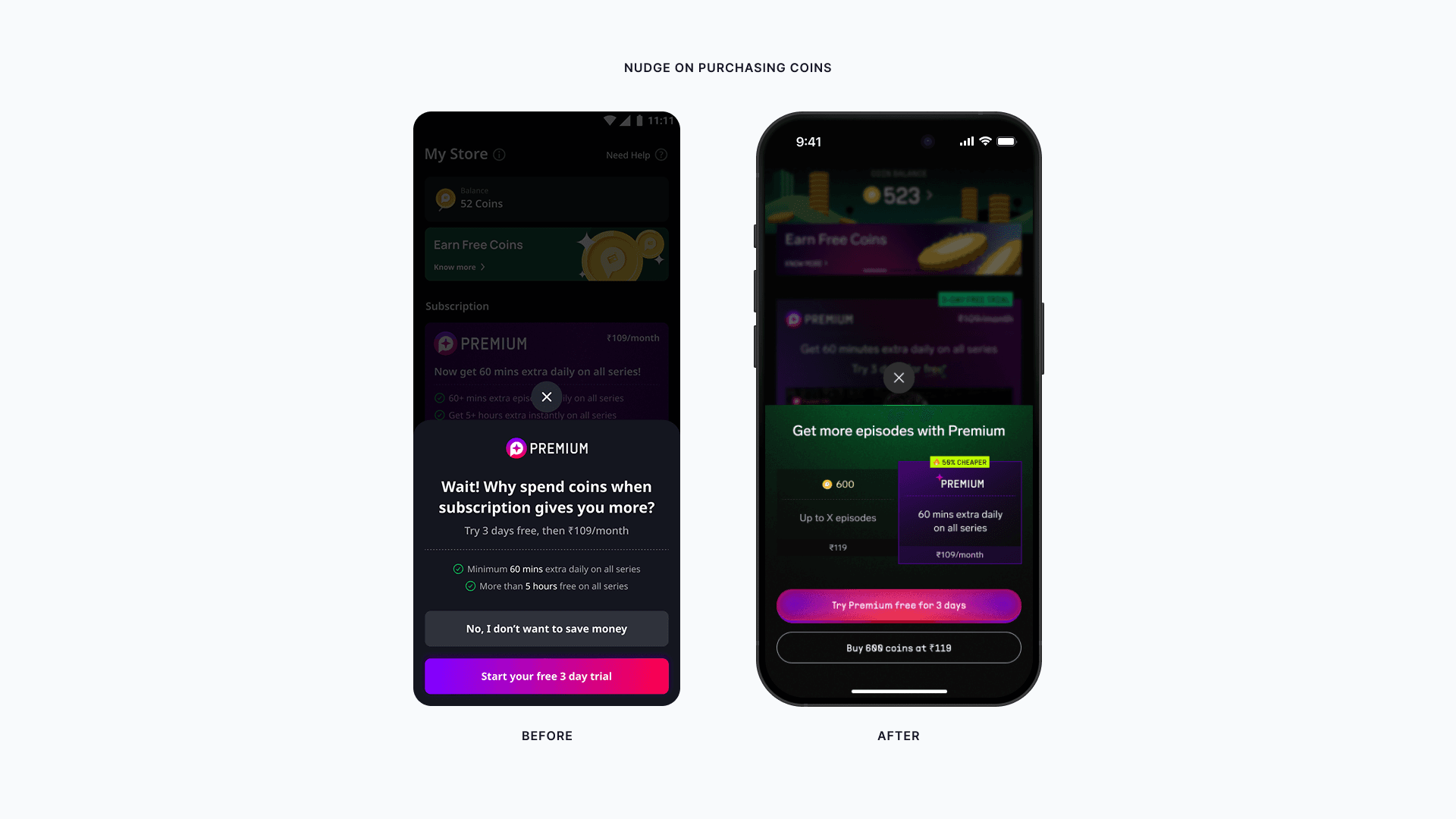
Success-state Rive animation
I shaped the post-subscribe success-state idea and collaborated with Harsshavardan S, who led the Rive execution. The animation runs after purchase so the success screen feels like a product moment, not a payment receipt.
The problem
The screens above make the solution look direct. The hard part was the model underneath. Listeners bought coin packs and spent them to unlock episodes, and that PPV economy generated most of the revenue.
Users kept asking for subscription: more access, less friction, a value story they could understand mid-listening. The business needed recurring revenue. I had to design one Premium model that served both while keeping the listener promise and the revenue model separate. The constraint was firm: PPV revenue had to hold. A generous plan would collapse the coin economy. A restrictive plan would stall conversion.
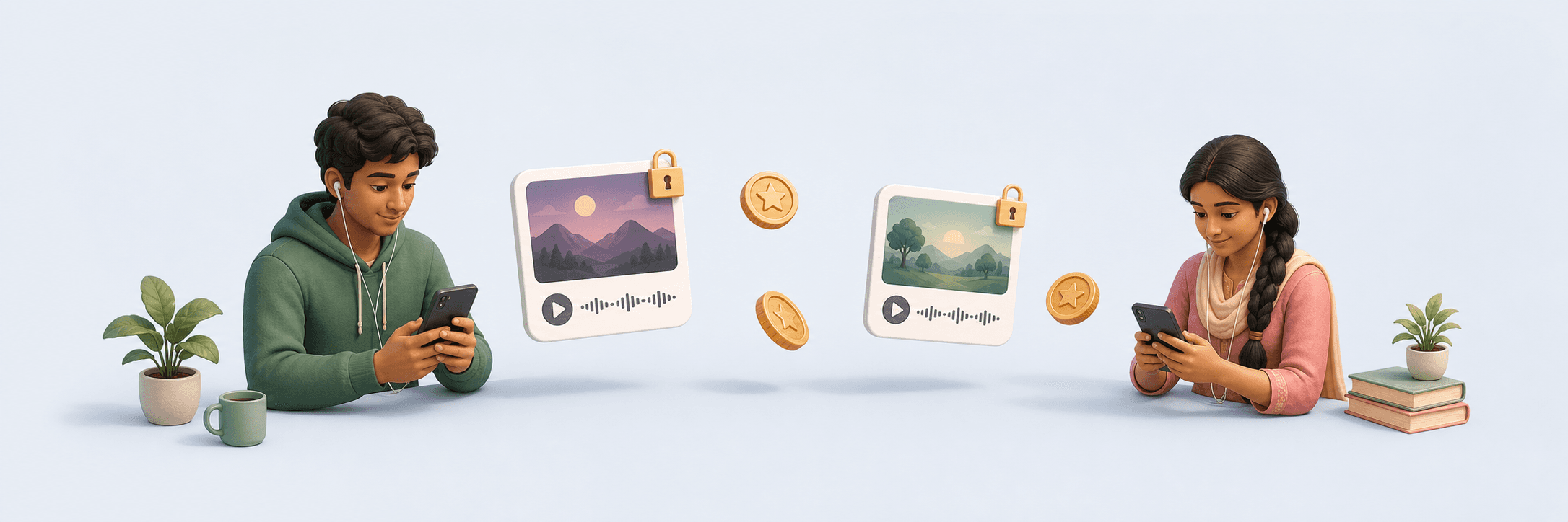
Tier 2/3 India users expected a subscription to unlock the catalogue. Our plan did something narrower: 60 minutes of daily free episodes per show plus ad-free listening. After that, paid and free users still met the same coin wall. I had to make extra access feel worth paying for without making coins feel obsolete.
There was no prior subscription product. I was starting from zero.
Research
After V1 shipped, user researcher Rachit Jain ran qualitative interviews with R2+ renewal cancellations. I joined the plan and the calls, then reframed V2 around the real churn trigger: users saw an unexpected bank debit and felt consent had broken. One line kept coming back: "Bina puchhe paisa kaat liya." Money taken without consent.
Subscribers could see which episodes Premium unlocked, reducing benefit ambiguity at renewal.
Users no longer had to separate daily and Premium unlocks in their head. The full benefit lived in one place.
A middle option during the highest-risk cancellation window reduced rage-cancels.
Key decisions
Before locking the model, we tested the major shapes a subscription could take: full app access, 120-min and 90-min daily unlocks, catalogue models with a fixed set of free shows, extra coin bundles. Each strained a different side of the economy. I centred the strategy on trust: users had to see why a constrained model was worth paying for even when it could not promise unlimited access.
I used two filters for each construct: does the user understand what they are getting, and does the business survive if they do? The 60-min daily unlock passed both.
Read experiment data and activation metrics to find where the funnel broke and what to fix first.
Joined R2+ renewal cancellation interviews with Rachit to understand the trust and consent problem under the numbers.
Sat in on user calls to watch how Tier 2/3 listeners interpreted the subscription offer in real time.
Worked with product, research, and engineering to pressure-test each construct against understanding and revenue.
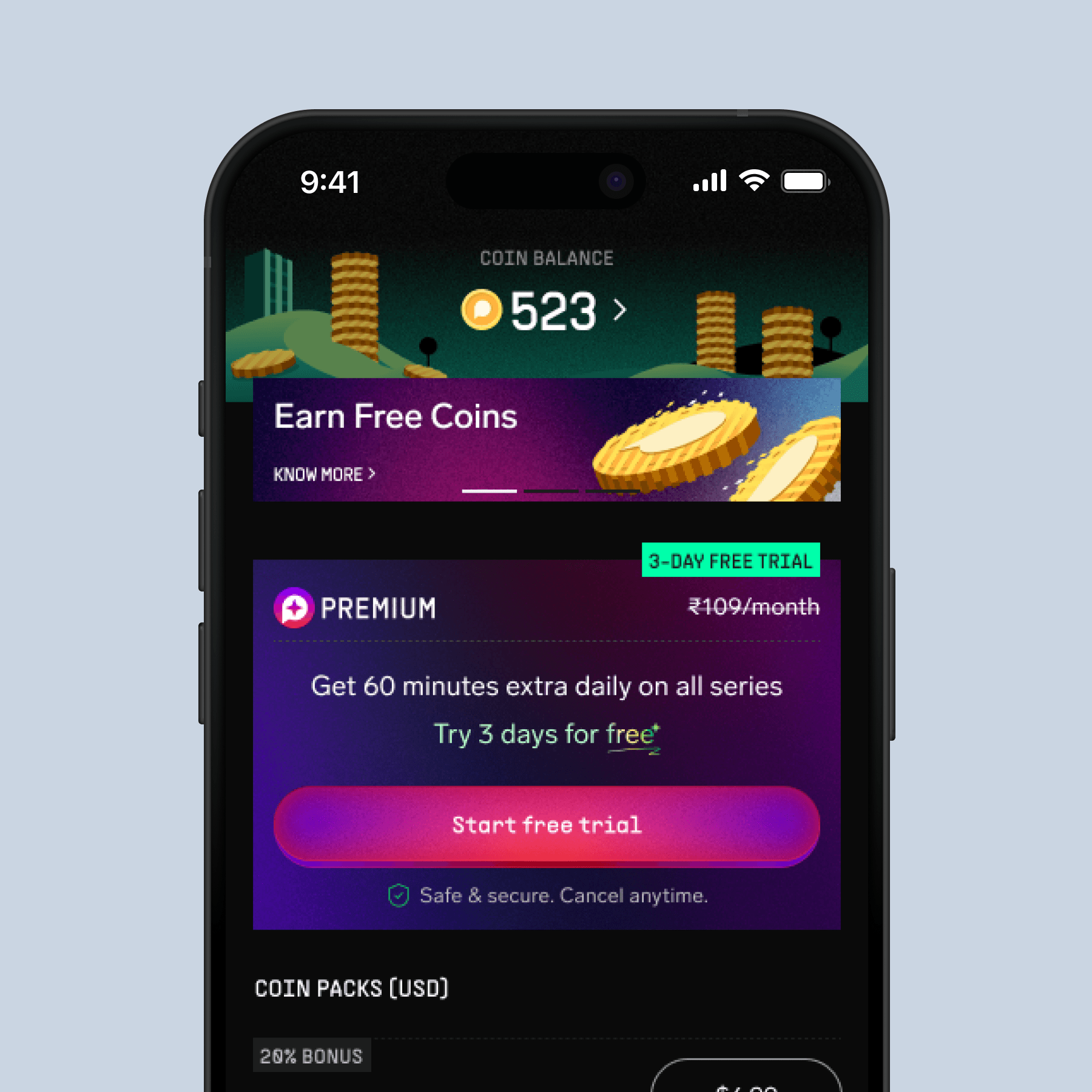
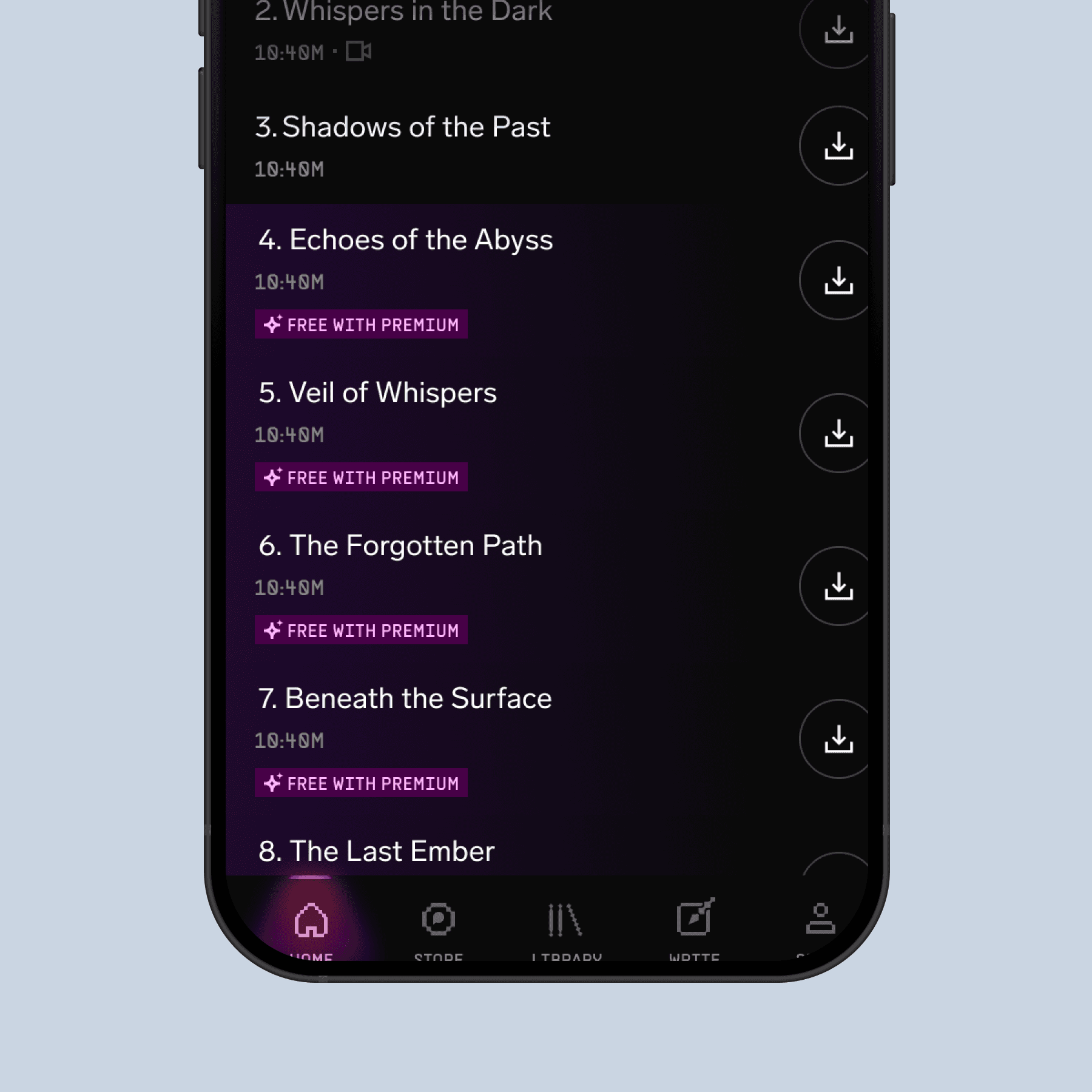
I gave the daily unlock a persistent identity before and after trial. The label changed from 'Free' during trial to '60 mins' after, but placement and purpose stayed consistent. Premium became easier to compare against a benefit listeners already understood.
Reduced confusion at the trial-to-paid transition
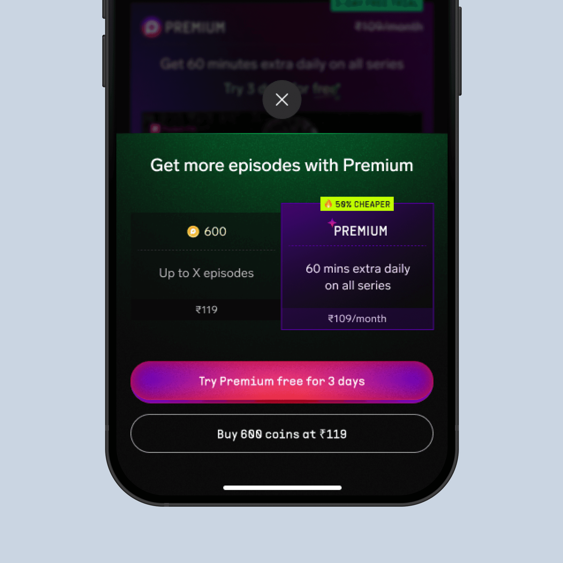
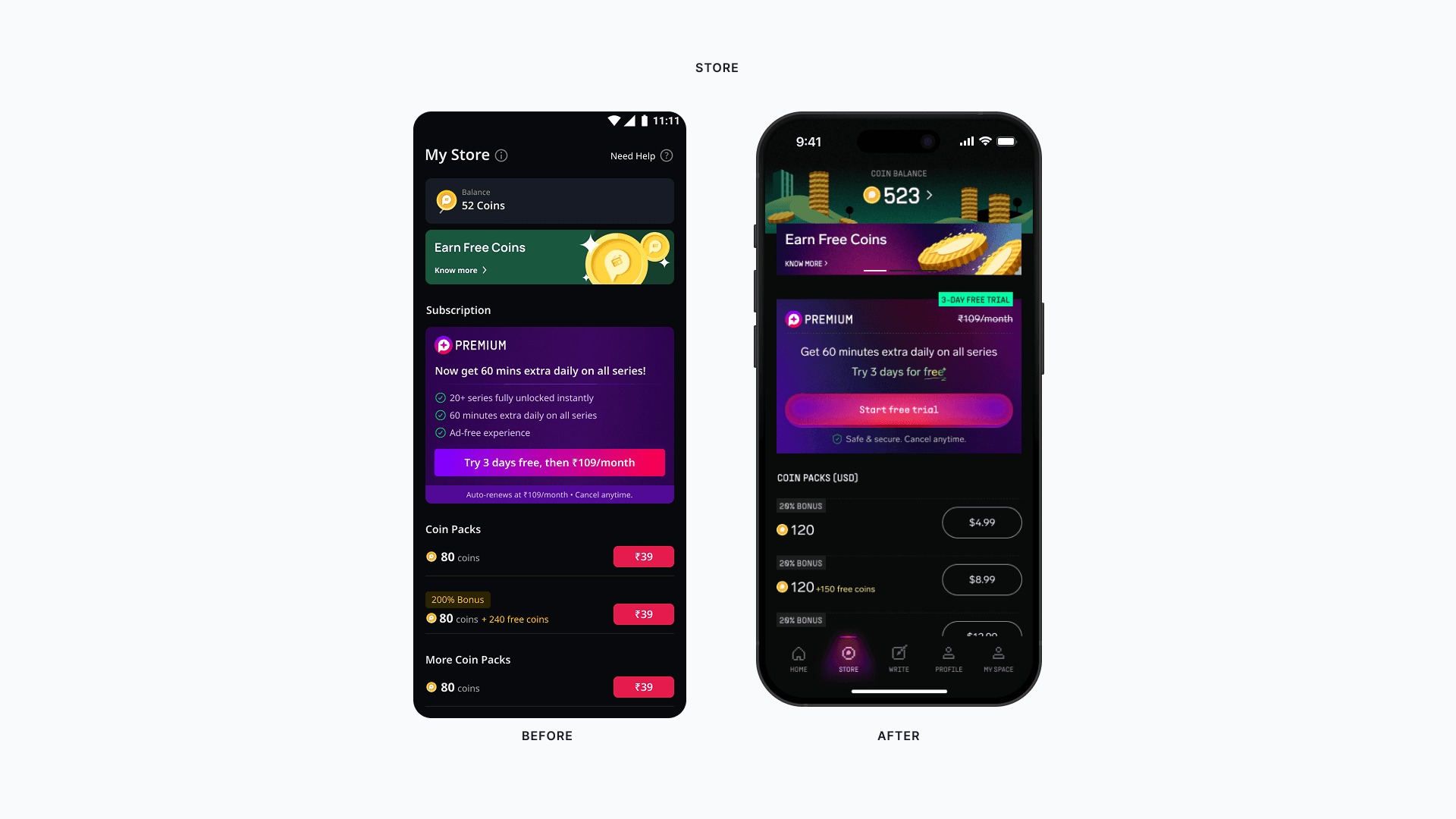
I moved the Premium savings comparison into the coin-purchase moment, where regular spenders weigh payment decisions. Real coin math answered the listener's next question: how much will this unlock path cost me over time?
16% uplift in premium conversion at the coin-purchase touchpoint
I limited Premium nudges to payment and unlock moments. V1 data showed reminders were not the bottleneck once users understood the offer, so I shifted the work toward clearer value, trust, and daily unlock usage.
V2 conversion held with a quieter experience
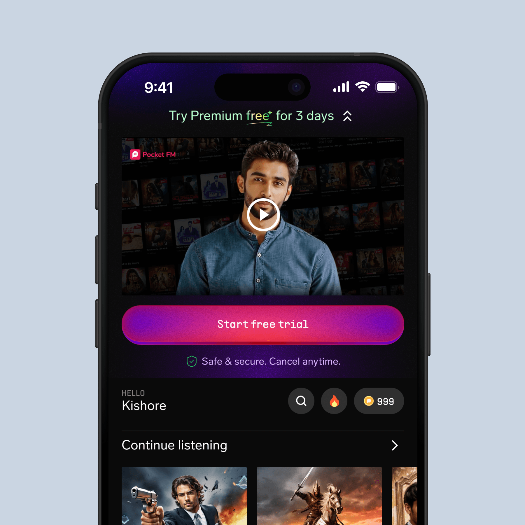
Activation data showed weak first-hour listening and primary-show adoption among Tier 2/3 users. I added Hinglish video explainers to onboarding and paywall moments, owning the brief, placement, and handoff.
Activation and first-hour listening recovered after explainers shipped
How it unfolded
First end-to-end subscription experience across India and USA; trial adoption reached ~55% on allocation.
Expanded daily unlocks to 2H on non-primary shows; adoption rose 5%, playtime 8%, M1 11%, M2 6%.
Moved Premium onto Aural, added reusable subscription components, reduced nudge frequency, tightened renewal and savings moments.
Subscription reached ~20% of total revenue with 400K+ active subscribers while PPV revenue held.
Accessibility note: Parallel to Premium, I led an iOS and Android accessibility pass and built A11Y Assistant, a Figma plugin for VoiceOver label suggestions. That work sits outside this monetisation case study so the subscription story stays focused.
What I'd carry forward
The most consequential decisions, including the subscription model itself, happened before anyone drew a screen. Designers need to be in that room on day one.
In markets with complex product models, confusion drives more drop-off than reluctance. Explainers, localisation, and progressive disclosure belong in the funnel.
Pushback on over-nudging only holds if you can point to data. Build the instrumentation in from the start. Don't wait for V2 to diagnose what V1 broke.
A subscription surface has at least five states: trial, active, expired, lapsed, non-subscriber mid-session. Most teams skip the edge states and pay for it in renewal.