Problem
Noise Junior had the right ingredients, but the experience felt like a list of features. Parents still had to work out whether the child's watch was ready for the day.
A recruiter reached out with a design assignment for the Noise Champ 3 companion app. I treated it like a real product problem: understand the parent-child split, audit the current product, use public reviews as research signals, and redesign Home and Routine around trust, sync and child ownership.
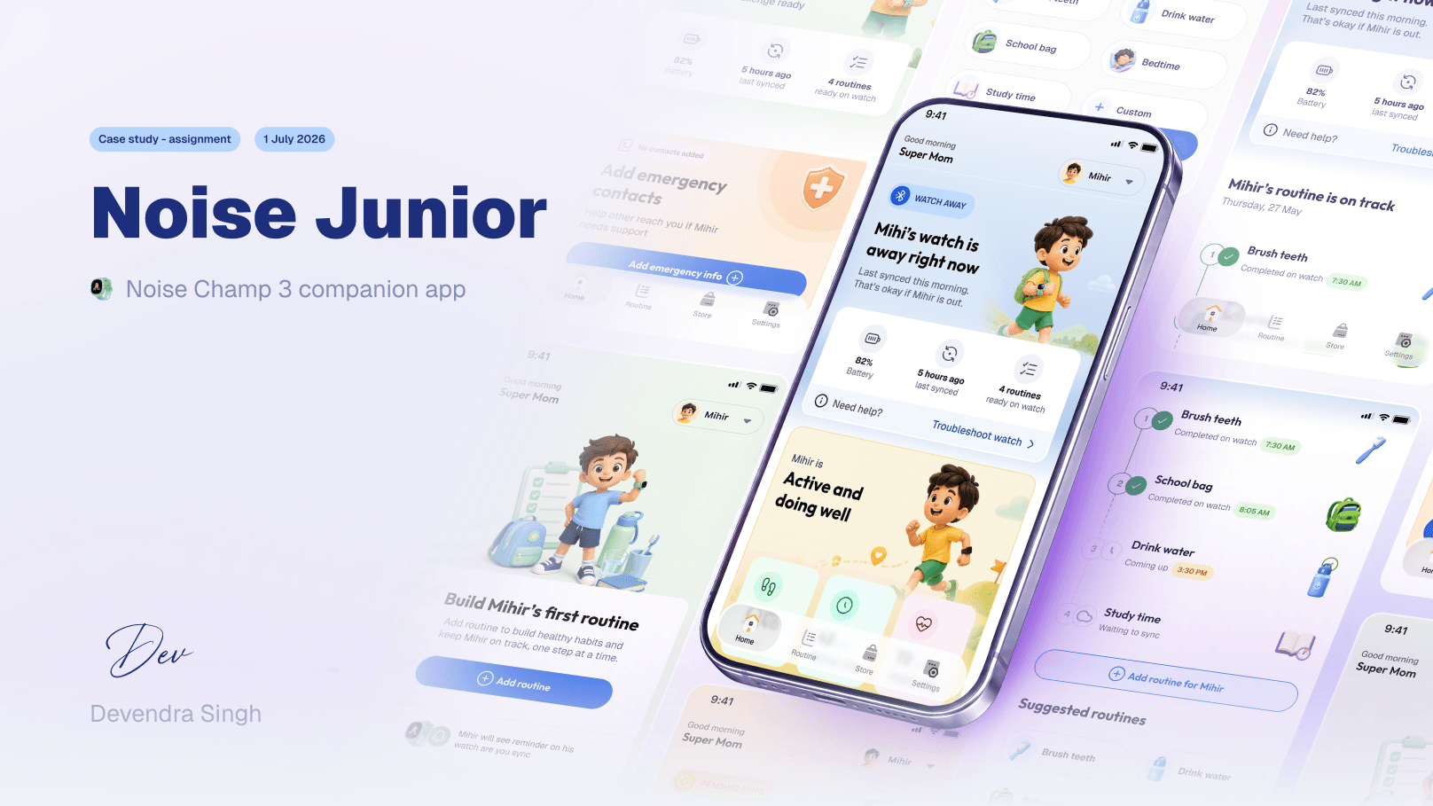
Noise Junior had the right ingredients, but the experience felt like a list of features. Parents still had to work out whether the child's watch was ready for the day.
I reframed the app around readiness, sync clarity, routine progress and child ownership instead of treating every feature as equal.
A redesign direction for Home and Routine: the parent prepares the day, the child owns the watch experience, and the app makes trust visible.
Product lens
Noise Junior is not just a smartwatch app. It is a parent-controlled setup layer for a child's first personal gadget. The phone app belongs mostly to the parent. The watch experience belongs to the child.
That split shaped the redesign. The parent needs calm, control and readiness. The child needs ownership, rewards, progress and a watch that feels like theirs.
My child's watch is ready for the day. Routines are synced, safety info is present, and anything pending is easy to see.
This is my first grown-up device and it feels like mine. I complete tasks, earn rewards, unlock progress and build small habits.
Problem framing
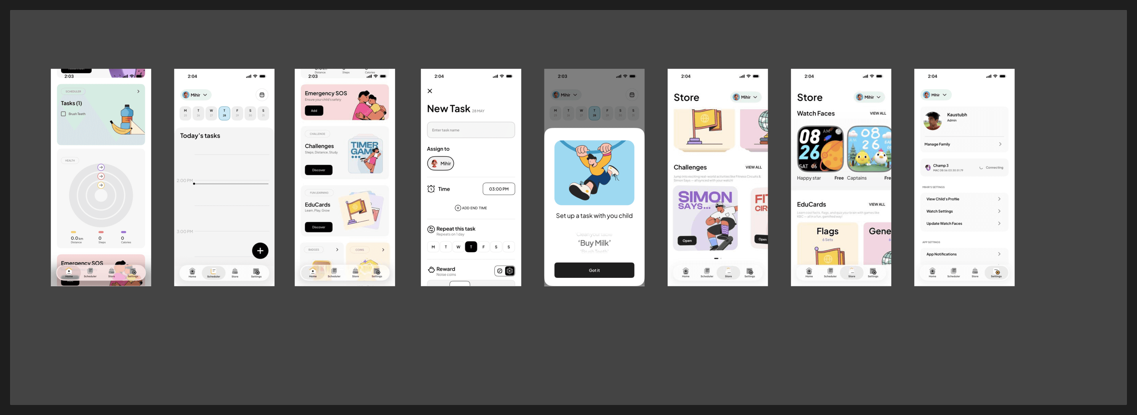
The current app already had routines, health, safety, challenges, EduCards, badges and coins. But Home behaved more like a feature catalogue than a daily helper.
Parents do not open this kind of app to admire modules. They open it to answer a few fast questions: is the watch ready, did today's routine sync, is anything pending, and what should my child do next?
Research signals
I did not have live users or the full watch ecosystem for this assignment, so I reviewed public feedback from app stores, marketplaces, videos and discussions. The pattern was consistent enough to guide the redesign.
The strongest signal from public reviews was not excitement about individual modules. Parents wanted to feel informed and confident.
Users often described the app as simple or easy. The redesign needed better priority, not extra complexity.
Pairing, login, sync and task completion problems quickly become UX problems because parents stop trusting the information on screen.
Because the watch depends on Bluetooth sync, states like pending sync, last synced and ready on watch had to move into the main experience.
Design principles
Redesign direction
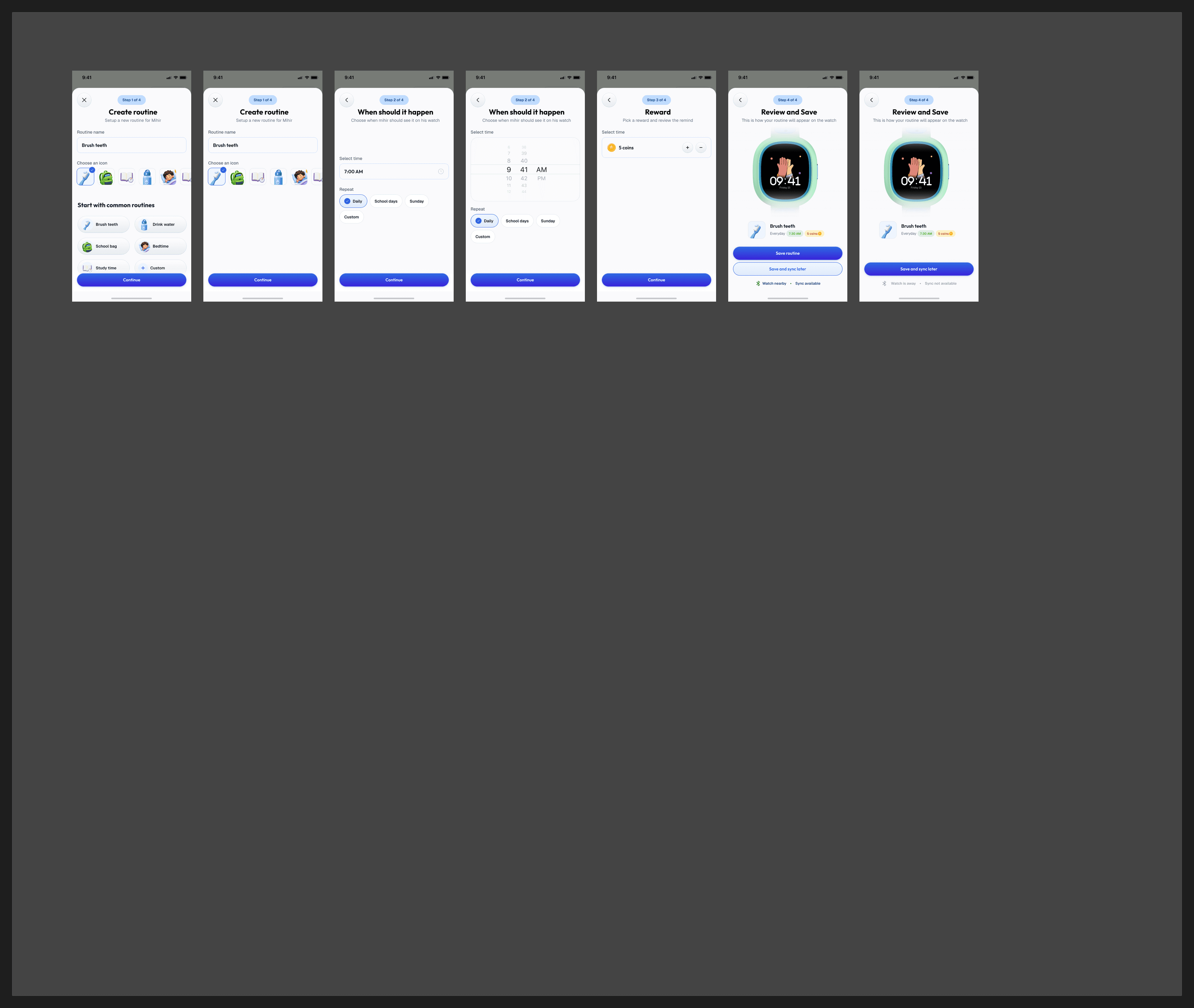
Key decisions
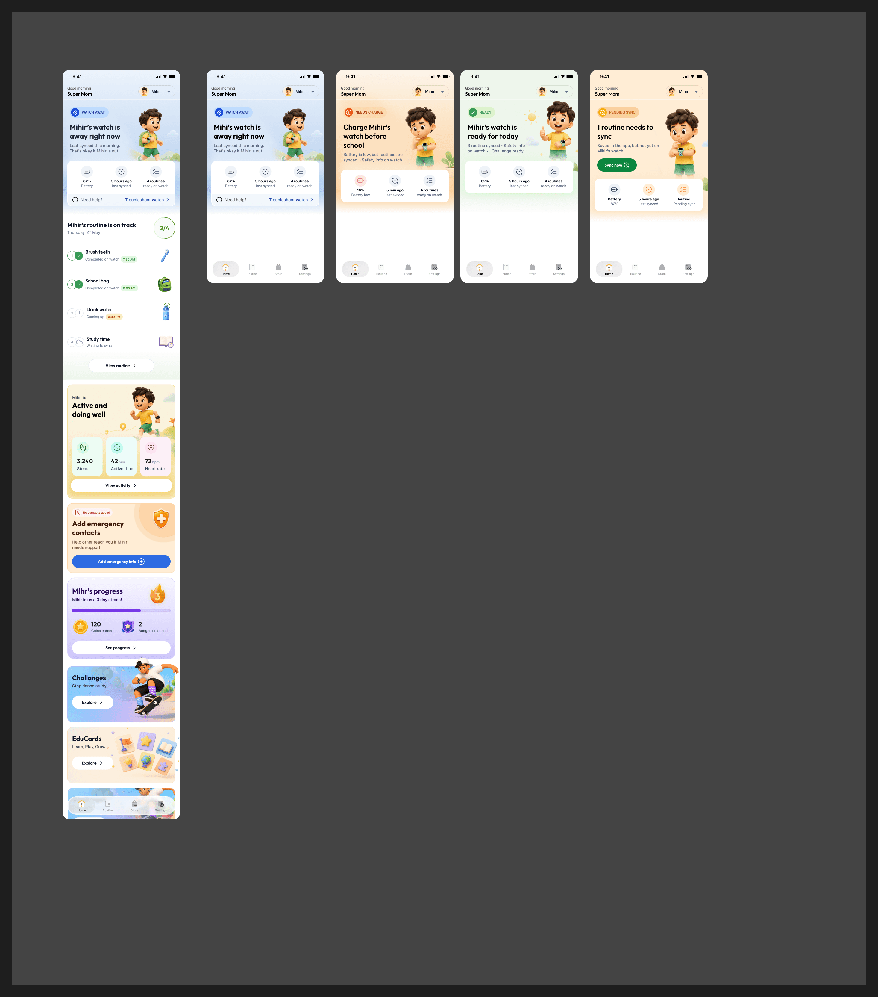
Home starts with the current watch state: ready, away, low battery or pending sync. This gives the parent one clear read before they scan feature cards.
Battery, last synced and routines ready on watch sit close to the hero state. They are small details, but they decide whether the parent believes the screen.
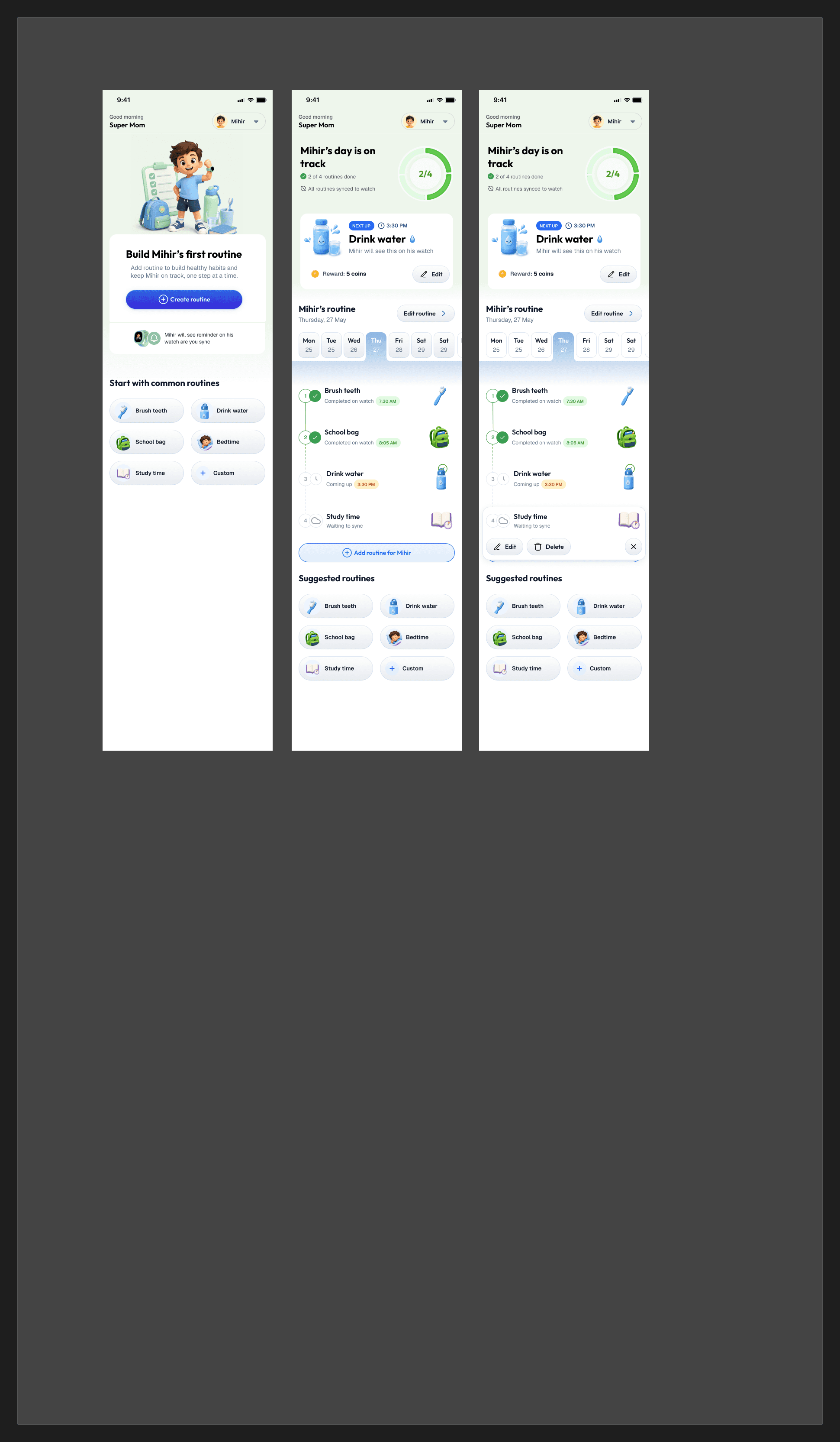
Routine became a timeline of what is done, what is next, and what is waiting to sync. It feels more like the child's day moving forward.
Instead of only showing steps, heart rate and active minutes, the design first interprets the state: Mihir is active and doing well.
Transparency
This was an assignment, not a shipped project. I did not have access to internal data, live parent interviews, engineering constraints, or the full watch-side behavior.
If this moved forward, I would treat the design as a strong hypothesis and validate these areas first: